Prompts for Work · Pack 8 · 10 prompt templates

Data & Reporting
AI Prompt Templates

Ten prompts that take a question from the metric definition to the board write-up. Every metric is defined before it is counted, every query reconciles to source, and every change is tested for whether it is real.

ChatGPT, Claude & Gemini Instant download No subscription Lifetime updates

Define, prepare, analyse, visualise, report

Run any prompt on its own, or run all ten in order. Each output feeds the next, building one Analysis Brief that the dashboard, the monthly report and the board write-up all check against.

Four rules in every prompt

These are what stop the AI reporting a number nobody has defined, reconciled or tested.

Define before you count

Every metric has a written definition, with numerator, denominator, grain, filters and source, before any number is reported.

Reconcile to source

Every query, workbook and dashboard ties back to a known total, such as the ledger or a system count, before its results are used.

Show the uncertainty

Sample sizes, confidence intervals and significance are stated. A change is never reported without saying whether it is real or within normal variation.

Answer first, with the limits

Every report leads with the answer and the decision it supports, and states plainly what the data cannot show.

One company, all ten prompts

Tessaly sells coffee subscriptions direct to consumers: $38M in revenue and about 120,000 paying subscribers. In June 2026 the board saw active subscribers up 12% and approved $1.5M of extra marketing for a free-grinder offer that had “won” its test. Three things were wrong. Since a system migration, paused subscribers were counted as active, so the real number had fallen 3%. A SQL join counted orders sent in two parcels twice, overstating average order value by 8%. And the test result was not statistically significant. Three reports gave three different subscriber numbers. Here is how the ten prompts rebuild the figures from one definition and put a corrected answer in front of the board, one step at a time.*

+12% → −3%

active subscribers, as reported and as defined correctly

3

different subscriber figures in three reports

8%

overstatement of average order value from one SQL join

$1.5M

approved on a test result with p = 0.21

Step 1 · Define

Business Question & Metric Definition

Turns the request into the decision it serves, and defines every metric precisely before anyone counts it.

Decision framingMetric definitionMetric dictionary

What Tessaly brought · CFO

“The board pack says 138,000 active subscribers. Finance says 131,000. Which is right?”

What the prompt returned

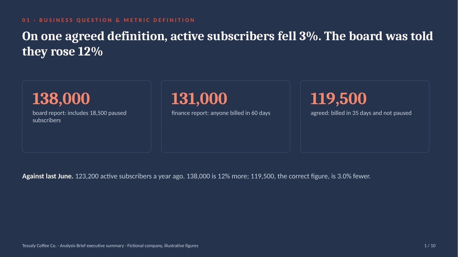
Neither. Since the April migration paused subscribers count as active. Defined as billed in the last 35 days and not paused, the number is 119,500: down 3% on last year, not up 12%.

Board report138,000: includes 18,500 paused subscribers
Finance report131,000: anyone billed in the last 60 days
Agreed definitionbilled in the last 35 days and not paused: 119,500
Against last year119,500 against 123,200: down 3.0%

The analysis · One undefined word turned a 3% fall into a 12% rise

A metric definition states exactly how a number is calculated: numerator, denominator, grain, time window, filters and source. A metric dictionary holds the agreed definitions so every report uses the same one.

  • 18,500 paused subscribers counted as active: the April migration mapped the “paused” status to “active”. The board figure of 138,000 included them.
  • Up 12% or down 3%: last June there were 123,200 active subscribers. 138,000 is 12% more; 119,500, the correct figure, is 3.0% fewer.
  • Three reports, three definitions: the board pack counted status, finance counted anyone billed in 60 days, and the correct definition counts billed and not paused within 35 days.

Takeaway: agree and write down every metric’s definition before reporting it, and restate past figures when the definition changes.
Step 2 · Prepare

Data Quality Assessment & Cleaning Plan

Checks the data for completeness, duplicates and valid values, reconciles it to a trusted total, and sets the cleaning rules.

Data profilingReconciliationCleaning rules

What Tessaly brought · Data Analyst

“Here’s the subscriber table and the Q2 billing export. Can we start the analysis?”

What the prompt returned

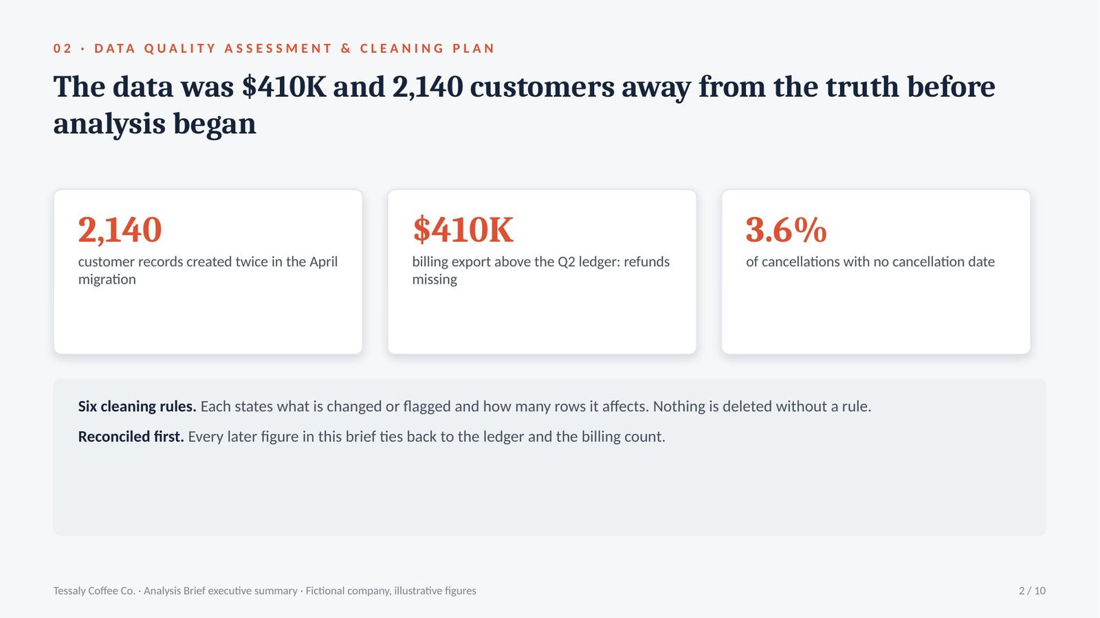
Not yet. 2,140 duplicate customer records from the migration, 3.6% of cancellations with no date, and the billing export is $410K above the ledger for Q2.

Duplicates2,140 customer records created twice in the April migration
Missing values3.6% of cancellations have no cancellation date
Reconciliationbilling export $410K above the Q2 ledger: refunds missing
Cleaning rules6 rules, each with the rows affected; nothing deleted without one

The analysis · The data was $410K and 2,140 customers away from the truth before analysis began

Data quality assessment checks data for completeness, duplicates, valid values and consistency. Reconciliation compares the data’s totals with a trusted source and explains every difference.

  • 2,140 customers counted twice: the migration created a second record for every customer who changed plan during the cut-over. The subscriber table held 2,140 more records than there were customers.
  • $410K above the ledger: the billing export for Q2 shows revenue $410K higher than the ledger, because refunds are recorded in a separate table that the export does not include.
  • 3.6% with no cancellation date: these cancellations cannot be placed in a month. They are flagged, not deleted, and the churn figures state the gap.

Takeaway: reconcile every dataset to a trusted total and write down each cleaning rule before any analysis starts.

Step 3 · Prepare

Spreadsheet Formula Design & Model Audit

Writes the formulas a calculation needs, explained line by line, and audits an existing workbook for errors.

XLOOKUP and SUMIFSError checksSpreadsheet audit

What Tessaly brought · FP&A Manager

“The board workbook has been rebuilt every month since 2023. Can you check it?”

What the prompt returned

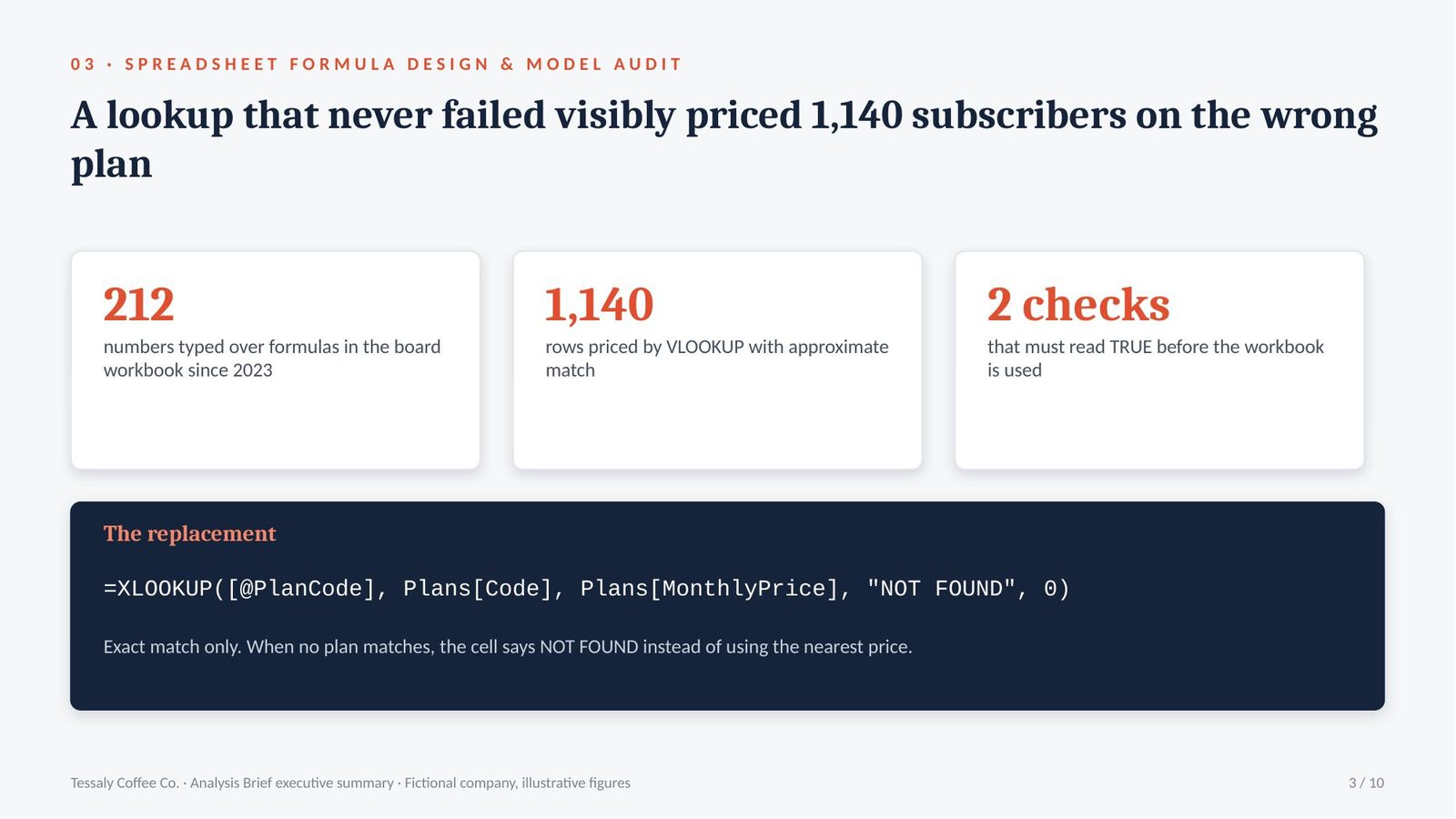
212 hard-coded numbers inside formula ranges, and a VLOOKUP with approximate match that priced 1,140 subscribers on the wrong plan. Rebuilt with XLOOKUP, exact match, and a check cell that ties to billing.

Hard-coded values212 cells typed over formulas since 2023
Approximate matchVLOOKUP(…, TRUE) put 1,140 rows on the wrong price plan
ReplacementXLOOKUP, exact match, “NOT FOUND” flag when no plan matches
Check cellTRUE when revenue ties to the reconciled billing total

The analysis · A lookup that never failed visibly priced 1,140 subscribers on the wrong plan

A spreadsheet audit checks a workbook for hard-coded values, faulty lookups, incomplete ranges and inconsistent formulas. An exact-match lookup returns an error when it finds nothing, instead of silently returning the nearest value.

  • 212 typed numbers: each month someone overwrote cells that did not calculate as expected. The workbook still looked complete, but 212 cells no longer changed when the data did.
  • 1,140 subscribers on the wrong plan: VLOOKUP with approximate match returns the nearest plan code when there is no exact one. Plans created after the migration had new codes, so 1,140 rows took the next plan’s price.
  • One cell that says TRUE: the rebuilt workbook compares its revenue total with the reconciled billing figure from prompt 02 and shows TRUE only when they match.

Takeaway: use exact-match lookups that fail visibly, remove every typed number from formula ranges, and add a check cell that ties to the source.

Step 4 · Prepare

SQL Query Writing & Review

Writes the query with its grain stated and every join checked, and reviews existing queries for the errors that inflate totals.

Query grainJoin fan-out checkRow-count reconciliation

What Tessaly brought · Head of Analytics

“Average order value jumped 8% after we added shipment data. Real, or the query?”

What the prompt returned

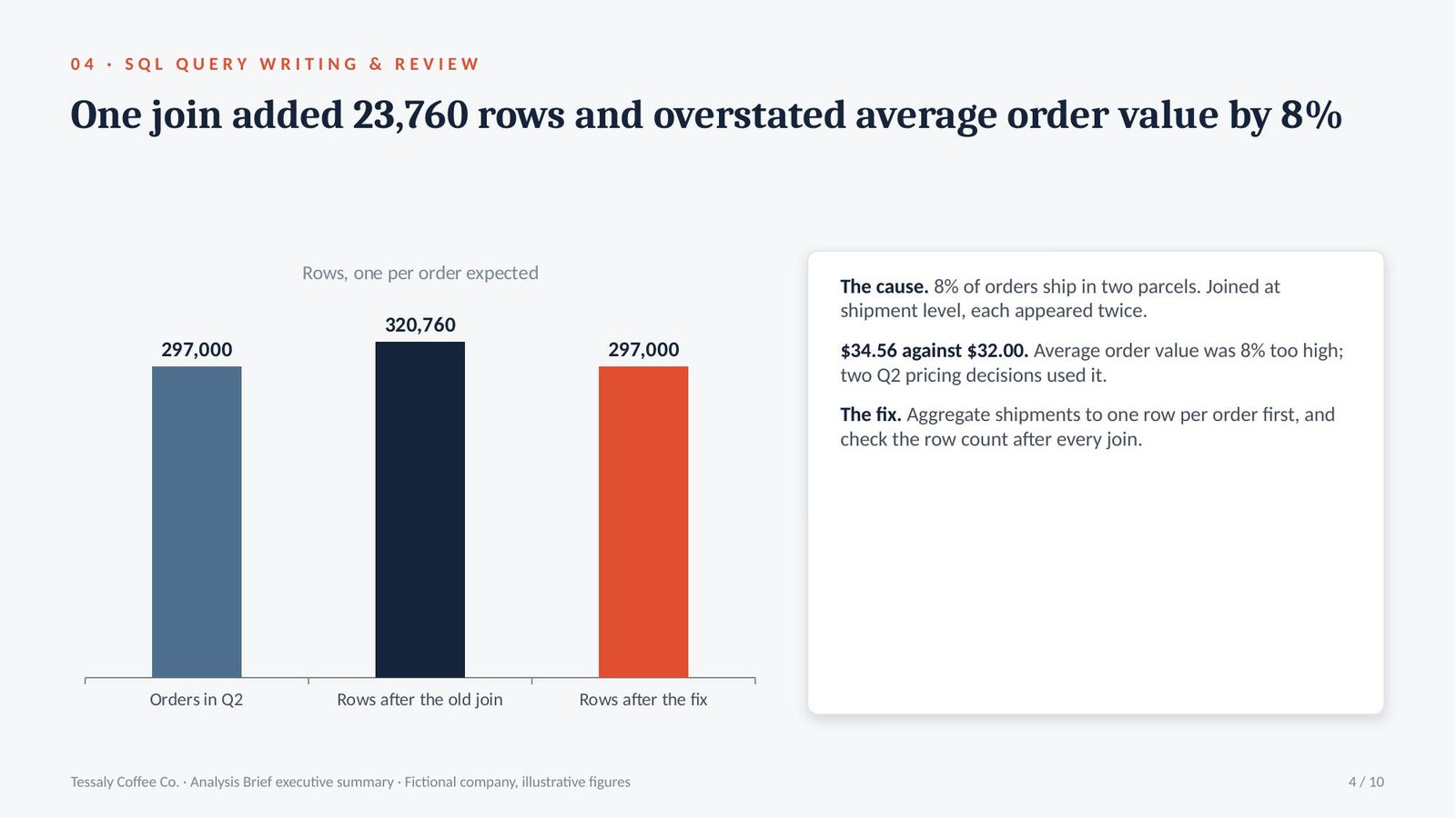
The query. Joining orders to shipments at shipment grain counts every two-parcel order twice: 320,760 rows from 297,000 orders. Aggregating shipments first brings average order value back from $34.56 to $32.00.

Orders in Q2297,000, one row per order
After the join320,760 rows: orders sent in two parcels appear twice
Fixaggregate shipments to one row per order before joining
Average order value$34.56 reported, $32.00 correct: overstated by 8%

The analysis · One join added 23,760 rows and 8% to average order value

The grain of a query is what one row represents: one order, one shipment, one customer. A fan-out join joins tables of different grain and repeats rows, so any sum after it is inflated.

  • 297,000 orders became 320,760 rows: 8% of orders are sent in two parcels. Joined at shipment level, each of those orders appeared twice and its value was counted twice.
  • $34.56 against $32.00: the reported average order value was 8% too high. Two pricing decisions in Q2 used the inflated figure.
  • A row count would have caught it: the corrected query checks that the row count equals the order count after every join, and stops if it does not.

Takeaway: state the grain of every query, check row counts after every join, and reconcile the result before anyone uses it.

Step 5 · Analyse

Exploratory Data Analysis & Segmentation

Looks at distributions, outliers and segments before any conclusion, and states what the data can and cannot support.

Distributions and outliersSegmentationData limits

What Tessaly brought · Head of Growth

“Churn is up. Is it everyone, or someone?”

What the prompt returned

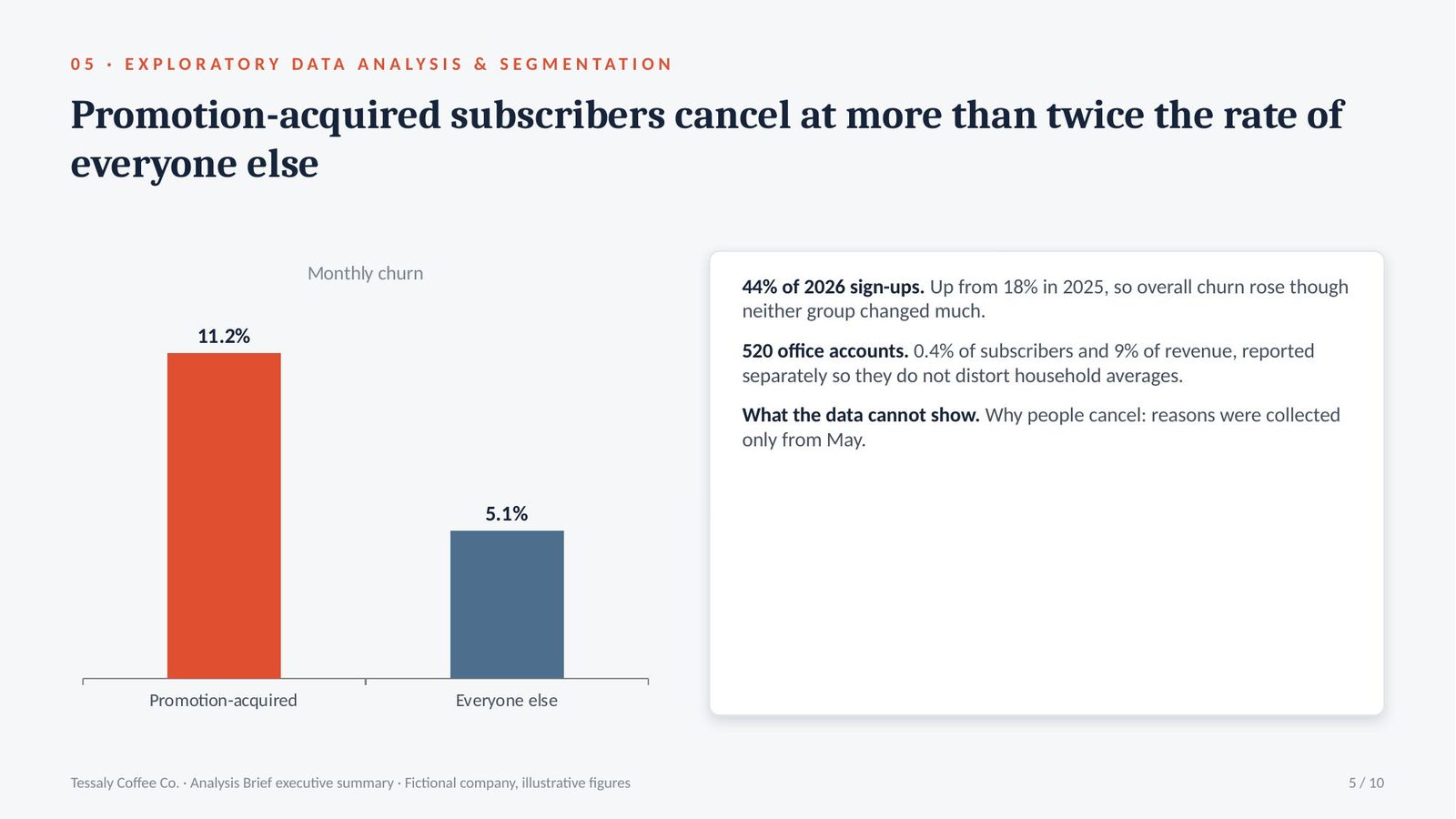
Someone. Subscribers acquired through promotional offers cancel at 11.2% a month, against 5.1% for everyone else. 520 office accounts are analysed separately.

Promotion-acquired11.2% monthly churn against 5.1% for the rest
Share of new subscriberspromotions: 44% of sign-ups in 2026, up from 18%
Outliers520 office accounts: 0.4% of subscribers, 9% of revenue
Cannot showwhy people cancel: reasons collected only since May

The analysis · Churn rose because the mix of new subscribers changed, not because all subscribers changed

Exploratory data analysis examines distributions, outliers and segments before any conclusion is drawn. Segmentation compares measures between groups, such as acquisition channel or plan.

  • 11.2% against 5.1%: subscribers who joined through a promotional offer cancel more than twice as often each month as those who joined at full price.
  • From 18% to 44% of sign-ups: promotions brought in 44% of new subscribers in 2026, up from 18% in 2025, so overall churn rose even though neither group changed much.
  • 9% of revenue in 0.4% of accounts: 520 office accounts order far more than households. Left in, they pull every household average up, so they are reported separately.

Takeaway: look at segments before the average, and separate the outliers before reporting any single figure.

Step 6 · Analyse

Cohort & Funnel Analysis

Follows groups of customers from their start date, and measures conversion at each stage, to find exactly where they are lost.

Cohort retentionConversion funnelRetention curve

What Tessaly brought · Head of Growth

“Where exactly are we losing the promotional subscribers?”

What the prompt returned

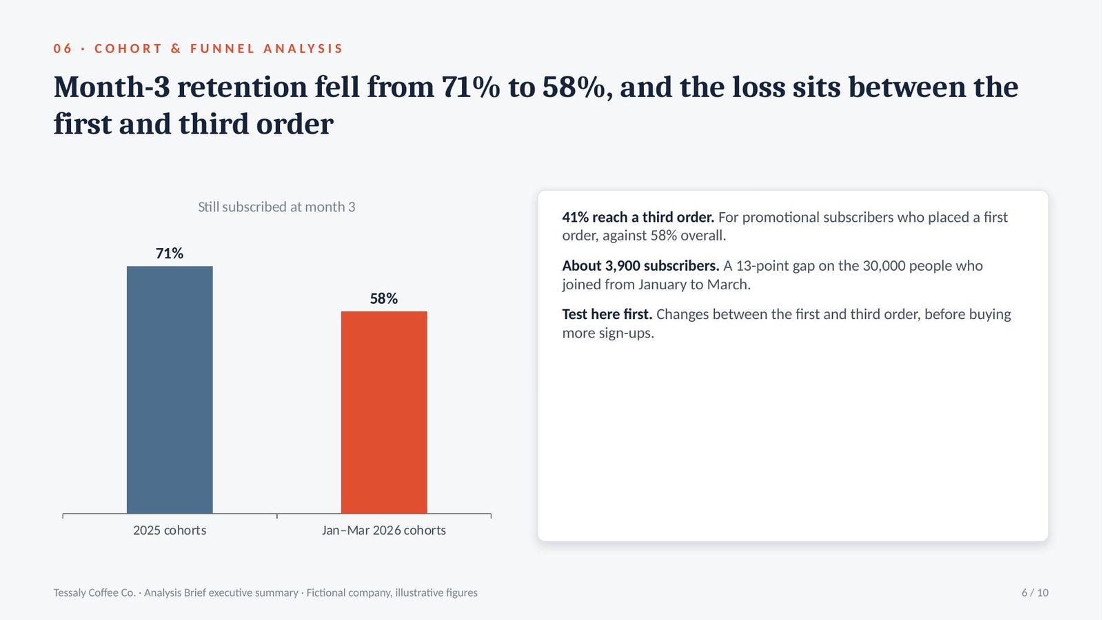
Between the first and the third order. Month-3 retention fell from 71% for the 2025 cohorts to 58% for January to March 2026, when promotions were 44% of sign-ups.

Month-3 retention71% for 2025 cohorts, 58% for Jan–Mar 2026
Funnelfirst order 62% of sign-ups, third order 58% of first orders
Weakest stagefirst to third order, promotional subscribers: 41%
Cost of the gapabout 3,900 fewer subscribers from the 30,000 Jan–Mar sign-ups

The analysis · The loss sits between the first and third order, in the promotional cohorts

Cohort analysis groups customers by the month they started and follows each group over time. Funnel analysis measures how many customers pass from each stage of the journey to the next.

  • 71% to 58%: three months after starting, 71% of the 2025 cohorts were still subscribed; for the January to March 2026 cohorts, 58% were.
  • 41% for promotional subscribers: only 41% of promotional subscribers who placed a first order went on to a third, against 58% overall. The free gift arrives with order one.
  • About 3,900 subscribers: 30,000 people joined from January to March 2026. A 13-point gap at month 3 is about 3,900 fewer subscribers from those cohorts alone.

Takeaway: measure retention by start cohort, and fix the stage where the loss is concentrated before buying more sign-ups.

Step 7 · Analyse

Experiment Readout: A/B Test & Statistical Significance

Checks whether a test result is real: sample size, confidence interval and significance, and the decision the evidence supports.

A/B testConfidence intervalSample size and power

What Tessaly brought · CMO

“The free-grinder offer won: 4.6% against 4.1%. That’s why we asked for $1.5M.”

What the prompt returned

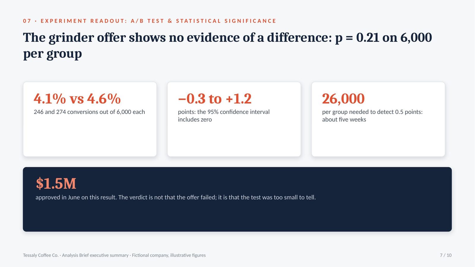
No evidence of a difference. With 6,000 customers in each group the p-value is 0.21, and the 95% confidence interval runs from −0.3 to +1.2 points. Detecting 0.5 points needs about 26,000 per group.

Control246 of 6,000 converted: 4.1%
Grinder offer274 of 6,000 converted: 4.6%
Significancep = 0.21; 95% interval −0.3 to +1.2 points
Sample neededabout 26,000 per group to detect 0.5 points

The analysis · $1.5M was approved on a result that could easily have been chance

An A/B test compares a control with a variant on randomly split groups. Statistical significance measures how likely a difference this size would be by chance; a confidence interval gives the range the true difference probably lies in.

  • p = 0.21: a difference this large would appear by chance about one time in five even if the offer had no effect. The usual threshold is one in twenty.
  • −0.3 to +1.2 points: the confidence interval includes zero, so the offer may have no effect at all. It also includes a real gain, which is why the answer is to rerun it, not to drop it.
  • 6,000 against 26,000: the test stopped at 6,000 customers per group. Detecting a 0.5-point difference reliably needs about 26,000, roughly five weeks at current traffic.

Takeaway: fix the sample size before a test starts, and report a result whose confidence interval includes zero as no evidence of a difference.

Step 8 · Visualise

Dashboard Requirements & KPI Specification

Specifies the dashboard from the decisions it supports: users, KPIs with definitions and owners, layout, filters and refresh.

Dashboard requirementsKPI specificationData refresh and ownership

What Tessaly brought · CEO

“Our dashboard has 31 tiles. I don’t trust any of them.”

What the prompt returned

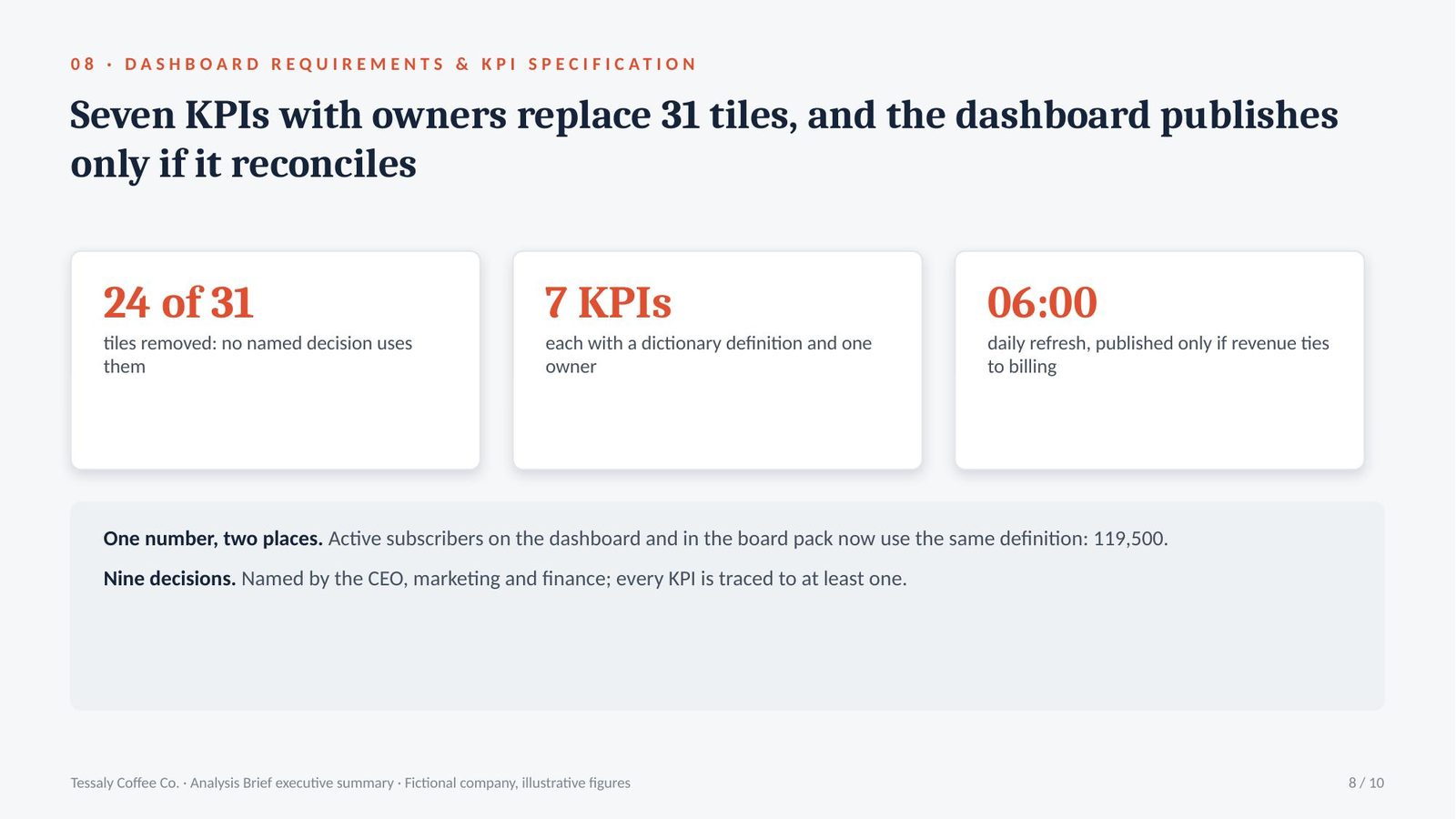
Seven KPIs, each with a definition, an owner and a target, for three audiences and nine decisions. 24 of the 31 current tiles are removed because no decision uses them.

UsersCEO, marketing and finance: nine named decisions
KPIs7, each with a definition from the dictionary and one owner
Removed24 of 31 current tiles: no decision uses them
Refreshdaily at 06:00, published only if it reconciles to billing

The analysis · 31 tiles and no definitions meant nobody trusted the one number that mattered

A dashboard requirements document states who uses a dashboard, which decisions it supports and exactly what it shows. A KPI specification gives each key performance indicator its definition, target, owner and data source.

  • 24 tiles with no decision: the CEO, marketing and finance named nine decisions they make each month. 24 of the 31 tiles supported none of them.
  • One definition, two places: active subscribers on the dashboard now uses the same dictionary definition as the board pack: 119,500, not 138,000.
  • Published only if it reconciles: each morning’s refresh is checked against the billing total before it appears. If it does not tie, the dashboard shows the previous day with a warning.

Takeaway: build the dashboard from named decisions, and give every KPI one definition and one owner.

Step 9 · Report

Monthly Performance Report & Commentary

Explains what moved this month and why, separates real changes from normal variation, and says what to do.

Performance commentaryNormal variationDriver analysis

What Tessaly brought · COO

“August numbers are in. What do I tell the executive team?”

What the prompt returned

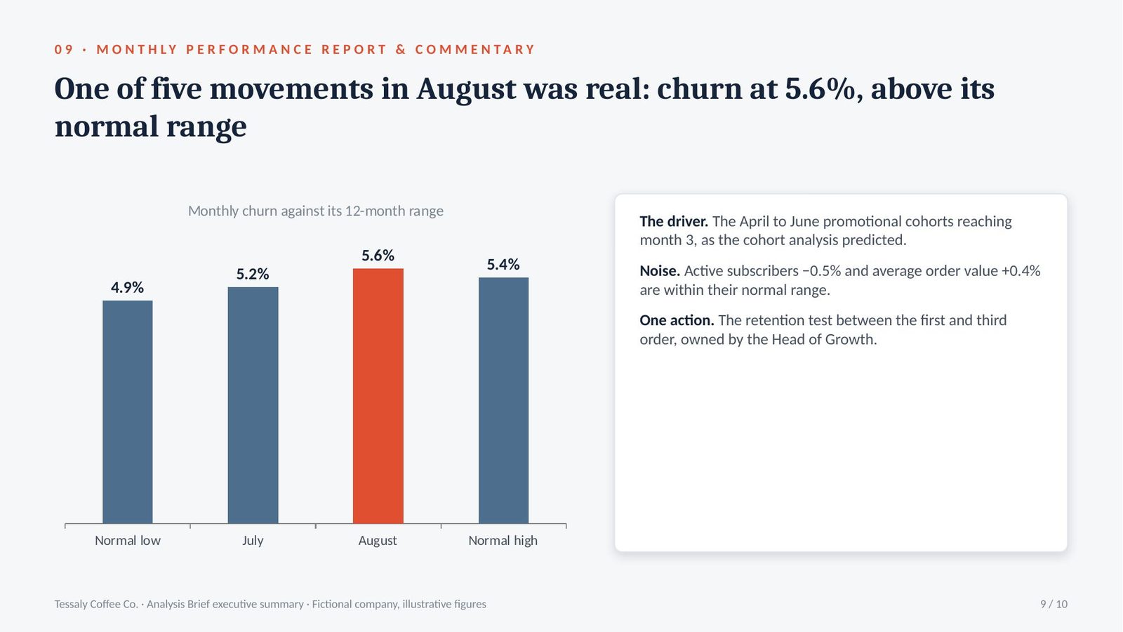
One real change: monthly churn rose to 5.6%, above its normal range, driven by the April to June promotional cohorts reaching month 3. Active subscribers fell 0.5%, within normal variation.

Active subscribers118,900, down 0.5%: within the normal ±1.1% range
Churn5.6% against 5.2% in July: above the normal range
Driverpromotional cohorts from April to June reaching month 3
Noiseaverage order value up 0.4%: within range, no action

The analysis · One of five movements in August was real, and it was predicted

Performance commentary explains what moved in a period and why. Normal variation is the range a measure moves within from month to month without any real change; movements inside it are noise.

  • 5.6% churn, outside the range: monthly churn has moved between 4.9% and 5.4% for a year. 5.6% is outside that range and needs an explanation.
  • The driver was already known: the April to June 2026 cohorts, the largest promotional intake of the year, reached month 3 in July to September. The cohort analysis showed month 3 is where promotional subscribers leave.
  • Four movements are noise: active subscribers −0.5%, average order value +0.4% and two other KPIs moved within their normal range. The report says so in one line each.

Takeaway: report which changes are outside normal variation and explain only those, stating plainly that the rest are noise.

Step 10 · Report

Analysis Write-up & Recommendation

Writes the analysis for the decision-maker: the answer first, the evidence, the confidence, the limits and the decision asked for.

Answer-first write-upConfidence and limitsRecommendation

What Tessaly brought · CEO

“The board meets on 14 October. What do we tell them?”

What the prompt returned

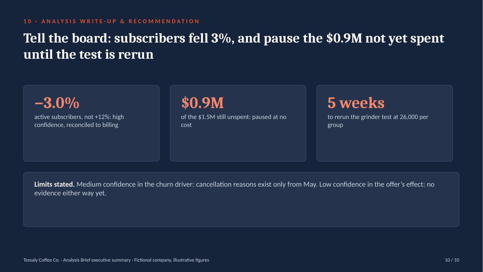
Active subscribers fell 3%, they did not rise 12%. Pause the remaining $0.9M of the $1.5M campaign and rerun the grinder test at 26,000 per group before spending it.

The answeractive subscribers down 3.0%, not up 12%
The askpause the $0.9M not yet spent of the $1.5M
The testrerun at 26,000 per group: about five weeks
Limitscancellation reasons exist only from May

The analysis · The correction comes first, and the $0.9M still unspent is the decision

An answer-first write-up states the conclusion and recommendation before the evidence. It gives a confidence level for each finding and states the limits of the data.

  • The correction in the first paragraph: the June board pack reported +12%. On the agreed definition, active subscribers fell 3.0%. The write-up says this before anything else.
  • $0.9M still unspent: of the $1.5M approved in June, $0.6M has been spent. Pausing the remaining $0.9M costs nothing until the test is rerun.
  • High, medium and low: high confidence in the subscriber count (reconciled to billing), medium in the churn driver (cohort evidence, no cancellation reasons before May), low in the offer’s effect (no evidence either way yet).

Takeaway: open with the answer and any correction, give each finding a confidence level, and end with a decision, an owner and a date.

The finale · what prompts 03, 04 and 08 produce

What the analytics team shipped

Three documents from Tessaly’s Analysis Brief: the rebuilt workbook formulas from prompt 03, the corrected SQL query from prompt 04, and the dashboard specification from prompt 08.

Board workbook — rebuilt formulas

Excel 365 · inputs, calculations and outputs on separate sheets

Tessaly Coffee Co.
Audit: 212 hard-coded cells removed

CellFormulaWhat it does
Subs[Price]=XLOOKUP([@PlanCode], Plans[Code], Plans[MonthlyPrice], "NOT FOUND", 0)Exact-match price for each subscriber’s plan; shows NOT FOUND instead of the nearest plan
Calc!C4=COUNTIFS(Subs[LastBilled], ">="&(ReportDate-35), Subs[Status], "<>paused")Active subscribers on the agreed definition: billed in 35 days, not paused
Calc!C8=SUMIFS(Billing[Amount], Billing[Month], ReportMonth, Billing[Type], "<>refund")Revenue for the month, refunds excluded as in the reconciled total
Checks!B2=COUNTIF(Subs[Price], "NOT FOUND")=0TRUE only when every subscriber has a matching plan
Checks!B3=ROUND(Calc!C8-Inputs!B4, 0)=0TRUE only when revenue ties to the reconciled billing total

Found

212

numbers typed over formulas

Found

1,140

rows priced on the wrong plan by VLOOKUP(…, TRUE)

Check

TRUE

every plan matched

Check

TRUE

revenue ties to billing

Q2 orders and average order value — corrected query

Grain: one row per order · shipments aggregated before the join

PostgreSQL
Reconciled to billing

-- Grain: one row per order, Q2 2026
WITH shipments_per_order AS (
  SELECT order_id,
         COUNT(*) AS parcels
  FROM   shipments
  GROUP  BY order_id              -- one row per order before joining
)
SELECT COUNT(*)                         AS orders,           -- expect 297,000
       SUM(o.order_value)               AS revenue,
       SUM(o.order_value) / COUNT(*)    AS avg_order_value,  -- $32.00
       SUM(CASE WHEN s.parcels > 1 THEN 1 ELSE 0 END) AS two_parcel_orders
FROM   orders o
LEFT   JOIN shipments_per_order s ON s.order_id = o.order_id
WHERE  o.order_date >= DATE '2026-04-01'
  AND  o.order_date <  DATE '2026-07-01'
  AND  o.is_test = FALSE
  AND  o.status <> 'refunded';
CheckOld queryCorrected
Rows after the join320,760297,000 — equals the order count
Average order value$34.56$32.00
Revenue against reconciled billingAbove by the value of two-parcel ordersTies

Subscription dashboard — KPI specification

Seven KPIs for nine decisions · 24 of 31 old tiles removed

Refresh daily 06:00
Published only if it reconciles

KPIDefinitionOwnerDecision it supports
Active subscribersBilled in the last 35 days and not pausedCEOGrowth budget
Monthly churnCancellations in the month ÷ active subscribers at the start of the monthHead of GrowthRetention spend
Month-3 retention by cohortShare of each start month still active three months laterHead of GrowthWhich offers to keep
New paying subscribersCustomers whose first paid order was in the monthCMOChannel budget
Acquisition costMarketing spend ÷ new paying subscribersCMOChannel budget
Average order valueRevenue ÷ orders, calculated at one row per orderFinancePricing
Revenue against ledgerDashboard revenue minus ledger revenue for the monthCFOWhether to trust the rest

Layout. Top row: active subscribers, churn and revenue against target. Below: cohort retention curves and the acquisition funnel by channel.

Filters. Month, plan and acquisition channel. Default: last complete month, all plans.

Refresh rule. The 06:00 refresh is published only if revenue ties to billing. If it does not, the dashboard shows the previous day with a warning, and the CFO is alerted.

Prompt output, formatted for this page. The prompts return the same content as text and tables; the figures come from whatever you paste in. Tessaly Coffee Co. is fictional, so every number here is ours to show you.

Pack 8 · Data & Reporting

Ten prompt templates, one running brief

  • Metric definition, data quality and cleaning plan
  • Spreadsheet formulas and audit, SQL query writing and review
  • Exploratory, cohort and funnel analysis, A/B test readout
  • Dashboard and KPI specification, monthly commentary, analysis write-up
  • Text file and formatted PDF · ChatGPT, Claude and Gemini

$15

One-time purchase · instant download

Get the pack

* Tessaly Coffee Co., its customers and all figures on this page are fictional and used for illustration only. Output from these prompts depends on the information you supply and the AI tool you use. Test formulas and queries on your own data before relying on the results.

Next step · the Presentation Generator

From the Analysis Brief to a board deck

The pack ends with the documents above. The McKinsey-Grade PowerPoint Generator is a separate product, $19: paste the Analysis Brief into it and it builds a board deck in Claude, as a real .pptx with native, editable charts.

Below is Tessaly’s executive summary: ten slides, one for each prompt’s output, unedited.

Tessaly Coffee Co. Analysis Brief executive summary, slide 1 of 10 Tessaly Coffee Co. Analysis Brief executive summary, slide 2 of 10 Tessaly Coffee Co. Analysis Brief executive summary, slide 3 of 10 Tessaly Coffee Co. Analysis Brief executive summary, slide 4 of 10 Tessaly Coffee Co. Analysis Brief executive summary, slide 5 of 10 Tessaly Coffee Co. Analysis Brief executive summary, slide 6 of 10 Tessaly Coffee Co. Analysis Brief executive summary, slide 7 of 10 Tessaly Coffee Co. Analysis Brief executive summary, slide 8 of 10 Tessaly Coffee Co. Analysis Brief executive summary, slide 9 of 10 Tessaly Coffee Co. Analysis Brief executive summary, slide 10 of 10
1 / 10

Tessaly Coffee Co. is fictional, so every number here is ours to show you. Generated in the NOVA house style.

Microsoft PowerPoint Want the deck built for you in one shot? The McKinsey-Grade PowerPoint Generator — $19

Built in Claude as a real .pptx with native, editable charts. Or take both generators together in the bundle, $25.

Back to The Prompt Library